From coded prototype to merged PR
A mini-case study about a shift in my process – and a shift in the scope of what I could deliver as a product designer, using AI coding tools – while working on the Proposals feature at Intuit.
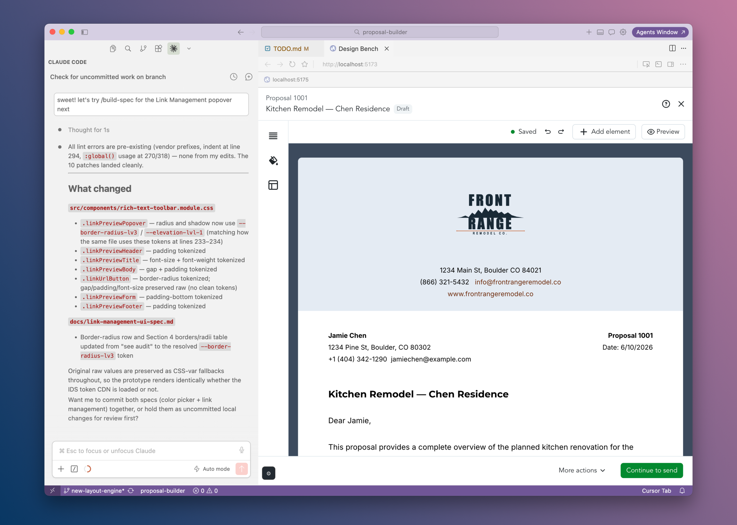
Moving my prototypes from Figma to code was a huge unlock. Turns out, keeping going all the way to production was too.
As soon as I had my first feature working in code, the gap between "prototype" and "shipped" looked a lot smaller than it did before. With tools like Cursor and Claude, I started asking: what if I just... kept going?
What if instead of handing this off, I spec'd it myself, brought it into our pre-prod environment, and opened the PR?
The three features below are what happened when I did. Each one is a different angle on the same shift: a designer who can close the loop on her own work, and build tools that help the whole team do the same.
Feature 01
Automatic text color inversion based on background luminance
Users could pick any accent color for the proposal header - but only light ones were actually safe. This feature made dark ones safe too, automatically, with no extra decisions required.
The problem
The Header block of our Proposal Builder (essentially the letterhead) supports a brand accent color as a background - a nice touch for conveying company identity. The problem: all proposal text mapped to a single semantic "Text" color that couldn't be adjusted per block. So picking a dark accent color meant your text became illegible. Users had an invisible constraint they mostly discovered by accident: only lighter shades were actually safe to pick.
The solution
I added logic to the Header block which reads the background's luminance and automatically inverts the text color when contrast gets too low. Dark background - text flips to white. (And it works in reverse too: if someone has a dark-mode proposal and picks a lighter accent, the text flips to dark.) The user picks whatever color matches their brand. It just handles the legibility. The results look professional without the user having to think about why.
How I did it
I prototyped the behavior in Cursor with Claude Code - getting it working and feeling right before worrying about production. Then I had Claude generate a spec from the prototype to bring it into our pre-prod development environment. While I was in there, I also moved the accent color swatch directly into the header block's settings panel (it had been living somewhere less intuitive). Then: my first PR in our Proposal Builder repo, a few rounds of code review, and it merged. From concept to code contribution in days.
Feature 02
Compact settings panels - and a design system that scales forward
We'd moved block settings on-canvas, from their old location in the side panel (a big step forward for builder ergonomics) but hadn't resized them (one step back). I shipped the intended compact form factor - and added logic so every new block added later would start there automatically.
A click-through of the settings panels, originally recorded for the GitHub PR. In a follow-up PR I smoothed out and added animated transitions to the panel show/hide states.

The problem
Engineering shipped a huge improvement for proposal builder ergonomics: settings panels moved on-canvas, appearing inline next to the blocks they control. The catch was that the engineer had to move on after after lifting-and-shifting - and the settings weren't resized to fit their new environment, just relocated. So now we had big, heavy controls floating next to blocks, completely out of proportion to the canvas. One step forward on the interaction model, one step back on the visual quality.
The solution
A coded prototype showing the panels at their intended compact scale - with a defined vertical rhythm (a padding system) and explicit component prop choices (eg "small" vs. "medium" for buttons, fields, radios). The less obvious part: since teammates were actively adding new block types (thus new settings) on other branches concurrently, and still working in the old side-panel settings form factor, I added logic that would carry this settings panel design system forward to any new canonical block automatically. The design system needed to travel with the code, not sit in a doc somewhere waiting to be missed. I essentially added something like Figma's autolayout to the code, ensuring the compact vertical rhythm stayed consistent.
How I did it
Same workflow as Feature 1: prototype in Cursor, spec from the prototype, Claude translates the spec into code in our dev environment. The forward-compatibility layer was the call I'm most proud of - if I'd just fixed the existing panels and moved on, I likely would have been opening a follow-up PR to update the new settings panels my teammates would have shipped after the Compact Settings update. By encoding the design system in the codebase itself, the right defaults travel with it automatically.
Feature 03
Closing the design-to-code translation gap with /build-spec
A custom Claude skill that extracts production-ready specs from my prototypes, lints for raw values, and bakes accessibility in by default. What started as a personal workflow tool ended up changing how my whole team ships - closing the gap between design intent and shipped code.
Generates a 'build-to' UI implementation spec for a prototype component or feature so a human engineer + AI agent can reproduce it accurately in production code. The skill produces a scaffolding-agnostic spec - prescriptive, not descriptive - documenting components, props, tokens, states, and behavior rather than the prototype's implementation choices.
The problem
My design team had enthusiastically adopted coded prototypes, moving our designs from Figma to code using Figma MCP + Cursor and/or Claude. But coded prototypes as handoff artifacts were still pretty new for us, and my engineering team was shipping fast. I needed to create something that an engineer (and their AI agent) could use to translate my prototype code to production code.
The solution
I created /build-spec: a custom skill that generates a "build-to" implementation
spec from prototype code. Scaffolding-agnostic,
it documents components, props, design tokens, states, and behavior without leaking
the prototype's implementation choices. I expanded it to also lint the code for raw values
(things that should be design token references but aren't - often a lost-in-translation
artifact from going Figma to code via MCP). It patches both the code and the spec,
and flags anything with no token equivalent so nothing slips through.
How it changed the team's work
I started generating the specs, and engineers starting handing them to their own AI agents - which enabled them to build feature UI significantly faster. The spec gave agents something precise to work from instead of interpreting a Figma file, and an explicit map compared to exploring the prototype code with GitHub MCP. As I got more embedded in the development process, I started using the specs for PR review too: checking built UI against what was intended, and flagging accessibility gaps. (Accessibility considerations are built into the skill, so they're in every spec by default - not something I had to remember to add separately.) The skill moved into the design team's shared end-to-end prototype repo to make sure all designers were able to spec from their designs with it. What started as a personal workflow tool became part of how the team works.
In closing
I started the quarter creating high-fidelity prototypes in Figma; I'm leaving it knowing how to ship my own features. Not in a "I can build anything now!" way - more in a "I understand what it takes to get a design decision all the way to production, and I can be part of that process end-to-end" way. My favorite part about this process was the camaradie I built with my engineering counterparts - from being added as a reviewer for PRs (which I could now locally run), joining them at their table, to the “one-of-us” reactjis in Slack when posting a PR I needed a review on.
The features above aren't just shipped work. They're evidence of a practice: prototyping in code as a design tool, specs as quality gates (not deliverables), and AI agents as a genuine collaborator in the design-to-engineering handoff. The /build-spec skill in particular - that one's less about what I shipped and more about what it enabled everyone else to ship faster.